• Guidelines
    • Display
    • Navigate
    • Forms
    • Layout
    • Prototype
  • Acme Marketplace
  • Guidelines
  • Display
  • Navigate
  • Forms
  • Layout
  • Prototypes
    • Guidelines
    • Display
    • Navigate
    • Forms
    • Layout
    • Prototypes
    • Release Notes
    • Sass Documentation
    • Gulp Documentation
    • CSS/SASS Stats
    • Preview All Components
Base by AppDirect

Guidelines

Foundational principles, guidelines and styles

Grid and Layout
Colors
Typography
Iconography and Icon Font
Coding Style
Writing Style
Animations
UIF for Sketch

UIF Sketch

Overview

We support a custom version of our UIF library for Sketch. Using the Sketch Library requires the installation of the latest Base Icon Font.
Older versions of the library are availabe from our GitHub Repository.

Download the UIF Sketch Template
Sketch Template version 1.7
Older versions of the Sketch Templates

Requires Access to our Github Repo: Older Sketch Templates

Sketch Product Website and Licenses

Latest Version: www.sketchapp.com

Tips and tricks

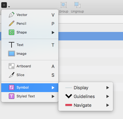
The reusable components are called "Symbols". Some tutorials how to incorporate them in the design process can be found in the official documentation. The symbol organisations mimics the Base2 structure.

  • Framework
  • Guidelines
  • UIF Sketch
  • Powered by AppDirect © 2022
  • Contact Support
  • Terms & Conditions
  • Privacy Policy
    • Contact Support
    • Terms & Conditions
    • Privacy Policy
Themes
    Assistant
    • Bonzi
    • Clippy
    • F1
    • Genie
    • Genius
    • Links
    • Merlin
    • Peedy
    • Rocky
    • Rover
    Hide
    4
    1366 × 768
    10.51%
    9
    1024 × 768
    4.02%
    3
    1280 × 800
    11.08%
    1
    1440 × 900
    16.09%
    7
    1600 × 900
    5.59%
    6
    1280 × 1024
    5.77%
    5
    1680 × 1050
    7.48%
    2
    1920 × 1080
    15.99%
    8
    1920 × 1200
    5.39%
    10
    2560 × 1440
    3.23%