Grid and Layout
Our grid is a complex yet consistent system that brings horizontal harmony, vertical rhythm and visual coherence to our interfaces. On all pages, you can click the the square button in the bottom-left corner of the browser window to preview the grid and check layouts.
Reset
We used Normalize.css and HTML5 Boilerplate as our starting point
Horizontal Layout
There are essentially 5 grid settings covering the entire responsive layout.
- XSmall
- half 5, content 6, content_half 3, sidebar 4, nav_list 5, subscription 3
- Small
- Medium:
- Large:
- half 6, content 8, content_half 4, sidebar 4, nav_list 6, nav_search 6, ubscription 4
- Large-Desktop:
- half 6, content 8, content_half 3, sidebar 4, nav_list 6, nav_search 6, subscription 4
- (fallback for non-responsive pages)
- XLarge:
- half 7, content 10, content_half 4, sidebar 4, nav_list 8, nav_search 6, subscription 3
In general, we use the float property only for arranging block elements in layouts. To ensure that interfaces remain consistent across pages and browsers, we define the widths of floated block elements according to the grid. Elements aligned within text, such as icons and labels, should not use the float property because floated elements are powerful and affect the layouts of both parent and sibling elements. Use display: inline-block instead.
For example, on the Marketplace Products results page, the logo, text and details for each product item are block elements that hit the grid. By contrast, the "Free Trial" label is an inline-block element; its placement changes with the length of the heading text and its width changes with the length of the text inside the label.
Nesting and Padding
Many times, designs require columned content in containers with padding and/or borders. The general rule followed in this framework is to subtract the left padding and border from the first element in the row and the right padding and border from the last element in the row. One example is the item blocks on the Marketplace Products results page. We include variables and mixins in the SASS structure to calculate widths and handle these cases.
Some complex interfaces may demand imaginative ways to handle the grid. For example, on the card pattern, company/user stats align to the grid. In general, the stats fall in the middle of 2 columns and their left/right borders fall in the middle of the gutter. The leftmost stat includes the left padding and border in its width and the rightmost stat includes the right padding and border in its width.
For elements that need whitespace between text and the boundaries of its container, such as a button, the framework uses the following padding values by default:
| Example | CSS |
|---|---|
|
XX-Small Padding
|
padding: 0px 2px; |
|
X-Small Padding
|
padding: 2px 4px; |
|
Small Padding
|
padding: 4px 8px; |
|
Medium Padding
|
padding: 6px 12px; |
|
Large Padding
|
padding: 8px 16px; |
|
X-Large Padding
|
padding: 10px 20px; |
|
XX-Large Padding
|
padding: 12px 24px; |
Vertical Spacing and Alignment
The framework also arranges elements on the vertical axis in a systematic way. The baseline height is 14px, which is also the default font size. Most elements come with default height and margin properties that define whitespace both within and between containers.
- Baseline Height:
- 14px
Margin
In general, the framework uses the following margin values for vertical spacing between block elements. However, in many cases, elements may use margin values as padding to create an even amount of vertical and horizontal space between a boxed element and its container box, such as buttons in the header of a table container.
| Example | CSS |
|---|---|
|
XX-Small Margin
|
margin: 4px; |
|
X-Small Margin
|
margin: 6px; |
|
Small Margin
|
margin: 10px; |
|
Medium Margin
|
margin: 14px; |
|
Large Margin
|
margin: 18px; |
|
X-Large Margin
|
margin: 22px; |
|
XX-Large Margin
|
margin: 24px; |
Leading and Height
Font leading or line-height refers to the height of a line of text. These values affect the vertical space between lines of text. In general, we do not use line-height to create vertical space or to center block elements vertically. Font leading values define whitespace to maximize the readability of text and are paired to font size values. In the framework, changes in font size always include changes in font leading with the help of SASS mixins. Use padding or margin properties for vertical spacing. Vertical centering should occur on a case-by-case basis.
| Example | CSS |
|---|---|
|
XX-Small Font Size and Leading
|
font-size: 8px; line-height: 12px; |
|
X-Small Font Size and Leading
|
font-size: 10px; line-height: 14px; |
|
Small Font Size and Leading
|
font-size: 12px; line-height: 18px; |
|
Medium Font Size and Leading
|
font-size: 14px; line-height: 22px; |
|
Large Font Size and Leading
|
font-size: 16px; line-height: 24px; |
|
X-Large Font Size and Leading
|
font-size: 20px; line-height: 26px; |
|
XX-Large Font Size and Leading
|
font-size: 24px; line-height: 30px; |
|
XXX-Large Font Size and Leading
|
font-size: 28px; line-height: 32px; |
The framework uses the following height values to delineate the vertical size of boxed elements with a single line of text, such as buttons and text input fields. Each height value is the sum of the corresponding font leading, vertical padding and border values. They help create consistent vertical sizes across elements and browsers.
| Example | CSS |
|---|---|
|
XX-Small Height
|
height: 14px; |
|
X-Small Height
|
height: 20px; |
|
Small Height
|
height: 28px; |
|
Medium Height
|
height: 36px; |
|
Large Height
|
height: 42px; |
|
X-Large Height
|
height: 48px; |
|
XX-Large Height
|
height: 56px; |
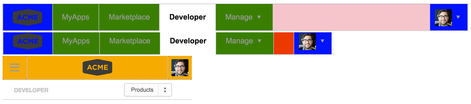
Responsive Layouts
Our grid system can provide support for mobile devices. We've added support to provide viewports for phone, tablet and desktop by adding 7 different breakpoints that result in 5 potential viewports.
Enabling mobile breakpoints
Adding the class
adb-responsive
on the body-tag will enable the mobile & tablet breakpoints.
Viewports
- root:
- 0 - 30em
- xsmall:
- 30.0625em - 40em
- small:
- 40.0625em - 50em
- medium:
- 50.0625em - 60em
- large:
- 60.0625em - 70.0625em
- large-desktop:
- 0 - 70.0625em
- xlarge:
- 70.0625em - 80em
- xxlarge:
- 80.0625em -
Progressive Enhancement
With the help of progressive enhancements we can enhance or degrade from detected features. We are detecting the following features via Modernizr: 'mediaqueries' & 'touchevents'.
The Sass mixins 'enhance-with' and 'degrade-from' provide progressive fallback or enhancement.
Visualising breakpoints
Visualising breakpoints can now be enabled by setting the visualization variable in your main theme file.
$show-breakpoints: true;
There is a fallback for browsers that don't support media queries like Internet Explorer 8.